This video is the latest in our Monday with Matthew series with Windermere Chief Economist Matthew Gardner. In this month’s special episode, Matthew takes a deep dive into the data that helped him shape his Op-Ed piece for Inman News.
Hello there! I’m Windermere Real Estate’s Chief Economist, Matthew Gardner, and welcome to a rather special episode of Mondays with Matthew.
Why special? Well, regular viewers of my videos will know that I generally take this opportunity to give you an update on the housing related numbers that came out in the month, but this time we are going to go in a different direction.
A few weeks ago, I was asked by the real estate publication, Inman, to pen an op-ed that would offer a counterpoint to this one which they had just published.
Well, I think that many of you will agree that it’s a pretty direct position and – judging by the comments I read following its publication – was certainly one where readers were very firmly on one side of the fence or the other!
Those of you that know me at all will probably have already figured out my position on this. I went ahead and crafted my response and I do take a different view on the matter!
As I am sure that some of you don’t have access to Inman’s website, I thought it might be interesting to share with you the reasoning behind my belief that we are not about to enter a period of declining home values; but even if you are an Inman subscriber and did read the piece, I hope that you will still find this video worth watching as I will also be sharing some of the background data with you that was not included in the article, as well as to give some more context on the subject.
Home Prices Out-Pace Wages
But to start with, I must acknowledge the fact that home prices have been rising at a significantly faster pace than wages for several years now and that may well be part of the reason why some people in the industry – and some perspective home buyers – are getting concerned.
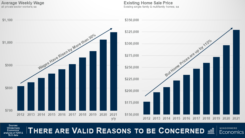
As you can see here, since 2012, average weekly wages have risen by a little more than 30%, with the average annual gain of around 2.3% which is actually not that bad. Wages also rose by over 6% last year, which sounds great, but in reality, it was because of the pandemic. You see, most of the job losses were in low-wage sectors which skewed the data upward – but I digress.
Anyway, during the same time period, you will see that even as wages rose, home prices have taken off and wage growth has simply not kept pace.
I often think about a quote from the Spanish philosopher and novelist, George Santayana, “Those who cannot remember the past are condemned to repeat it” which I think just about says it all!
Timeline
So, what we are going to do today is to take a look back and run through a brief timeline of events that led to the 2007 crash, and then look at where we are today and how it is totally different which leads me to speculate that there is no real reason why we should expect to see a widespread, systematic decline in home prices in the foreseeable future.
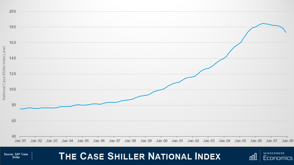
This first chart shows the Case Shiller National Home Price Index level over time and we’ll be using it as a base for this part of the discussion.
If you are not familiar with Case Shiller, its what’s known as a repeat sales index – which means that it looks at the change in sale prices between when a home was purchased and when it was sold and is a great way to look at changes in home prices.

Let’s start all the way back to the early 1990’s.
1992
In ’92, Congress enacted Title 13 of the Housing and Community Development Act and they did this to give low- and moderate-income borrowers better access to mortgage credit via loans supported by Fannie Mae and Freddie Mac.
1995
And in ‘95, President Clinton introduced a National Homeownership Strategy which had a very aggressive goal of raising homeownership levels from 65.1% to 67.5% by the year 2000 – that would be a rate of ownership in America that had never been seen before.
But this could only realistically happen if Fannie & Freddie significantly increased the share of mortgage funds going to lower income households. The Housing and Community Development Act required them to dedicate 30% of their portfolio to lower income borrowers – but the Clinton plan meant that they had to raise that share to 42%.
And it started out rather well with almost 2.8 million new homeowners created between 1993 and 1995 – and that was double that seen during the prior two years.
And because of the increase in demand that would come from greater loan volume, Fannie and Freddie moved to an automated underwriting process to speed up loan approvals. Interestingly, this then became an industry norm – but in going to an automated model, all they really did was to significantly relax the underwriting approval process.
1999
Now moving on to the very end of the decade, in November of 1999, Congress passed, and President Clinton signed, the Gramm-Leach-Bliley Act which, amongst other things, lifted most of the restrictions that prohibited any one institution from acting as any combination of an investment bank, a commercial bank, and an insurance company that were prohibited by way of the Banking Act of 1933 – otherwise known as the Glass-Steagall Act.
Now this is important as – in essence – banks could now underwrite and sell banking, securities, and insurance products and services which included, guess what, mortgage products.
2000
In 2000, the dot-com bubble burst. Something those of us here in Seattle remember all too well – and one of the major consequences of this was that investors moved away from the equity markets and, instead, turned their attention to the real estate market.
2001
By the start of 2001, the country was heading into a recession, and even though unemployment remained close to a 30-year low, the Federal Reserve wanted to stimulate borrowing and spending, so they started to lower short-term interest rates very aggressively.
2003
As you can see, over the next 3-years the market jumped with home prices rising by 7% in 2002 and 7.5% in 2003 as more would be home buyers found easier access to mortgage credit not just from Fannie or Freddie – but all of the other institutions that could now get into the game following the passing of the Gramm Leach Bliley Act.
And because of its success, the push to expand homeownership that had started under President Clinton continued under President Bush, and he introduced a “Zero Down Payment Initiative” that allowed – under certain circumstances – removal of the 3% down payment rule for first-time home buyers using FHA-insured mortgages.
2004
Well, the Bush and Clinton administrations saw their housing goals achieved with the homeownership rate increased steadily, peaking at 69.2% of households in 2004.
Ownership rates and rapidly rising home prices were driven by one thing.
Home buyers were consuming – with relish I might add – rare mortgage products with strange-sounding names such as Alt-A, sub-prime, I-O – as in interest-only -, low-doc, no-doc, or the classic NINJA loans, NINJA being an anacronym for “no income, no job, no assets”. There were also 2–28 and 3–27 loans; liar loans; piggyback second mortgages; payment-option and even “pick-a-pay date” adjustable-rate mortgages.
What could possibly go wrong!
2005
And by 2005, sub-prime mortgages had risen from 8% of total loans made in 2003 to 20%, with about 70% of sub-prime borrowers using the hybrid 2/28 and 3/27 ARMs I just mentioned, and these were mortgages with low “teaser” rates for the first two or three years, and then they adjusted periodically.
And when you add in Alt-A mortgages, the total share of just these two mortgage products rose from 10.4% in 2003 to 39.4% in 2005.
Many people chose their financing poorly. Some clearly wanted to live beyond their means and, by mid-2005, nearly 25% of all borrowers across the country were taking out interest only home loans which gave them a lower monthly payment, as they weren’t worried about paying down the principal because home prices were going to continue to skyrocket forever – right!!?
2006
By the end of 2006, a full 90% of all sub-prime mortgages were ARM’s and with a doubling of the sub-prime share, about $2.4 trillion of new sub-prime and non-prime mortgages were used to buy homes.
2007
Well, in 2007 over $1 trillion worth of ARM’s were about to reset, and this is what really took the market down.
Why? Well, back in July of 2004, the Fed started to raise interest rates, and with all the ARM’s starting to reset, a massive number of homeowners just couldn’t afford their new payments and they started to default in droves.
2010
The ultimate outcome was that in 2010 over 2.2% of all homes in America were foreclosed on – that almost 2.9 million homes – in just one year.
So what makes it different this time around?
That’s the history lesson, so let’s compare and contrast where we are today with what happened back then.
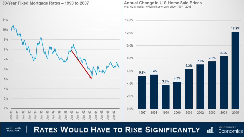
As we discussed earlier, the Fed started to lower interest rates following the dot-com bust and that flowed down to the mortgage market and rates also started to drop but it wasn’t just the Fed – investors did what they usually do during periods of economic uncertainty – they moved a lot of money into bonds, and this has a far more direct effect on mortgage rates.
By 2004, mortgage rates had dropped to a record low.
And as rates dropped, look what happened to prices – they started rising as buyer purchasing power rose, but that’s far from the only reason why home prices rose so significantly, but we will get to that later.
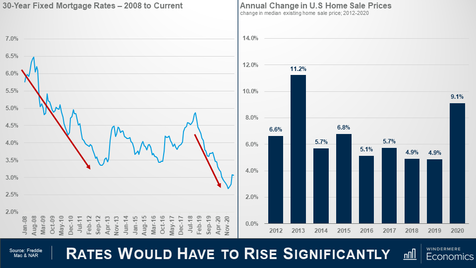
So, moving forward in time, you can see that rates dropped again as the financial crisis was taking hold and the country was entering a recession and rates dropped even more staring in 2019 as the Fed became concerned about inflation, slowing global growth, and trade wars.
And they offered further supported to the housing market at the onset of the pandemic by aggressively buy bonds which effectively lowered mortgage rates even further.
So far, you may be thinking, “well, its clearly the same as last time”, but I’m afraid that you’d be wrong.
You see, although sale prices surged in 2013 – realistically because home prices over corrected on the downside following the bubble – average annual price growth since 2013 has been slower we saw pre-bubble.
The median sale price rose by an average annual rate of 7.6% between 2000 and 2005, but between 2014 and 2020, the pace of appreciation was a full 1.5 percentage points lower.
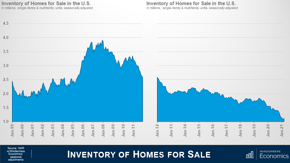
I am going to talk more about mortgages shortly, but it’s important to touch on another significant difference between the 2000’s and now and that’s housing supply.
As you can see here, starting in 2001, inventory levels rose and peaked just as the bubble was about to burst. Why? Well, do you remember me telling you about the surge in unique mortgage products – specifically ARM’s?
1 in 10 borrowers in ‘05 and ‘06 took out “option ARM” loans and one-third of ARMs originated between 2004 and 2006 had “teaser” rates below 4%. Therefore, we started to see people try to sell before the rate reset and this led to the growth in listings. But how does that compare to what we’ve seen over the past several years?
The number of homes for sale has been sliding since the spring of 2011 and is currently at the lowest levels since data on total US listings started to be gathered back in 1999. Ultimately, the basic economic laws of supply and demand are working today. Prices rise on scarcity of product and lower cost of financing. Both of which we see here.
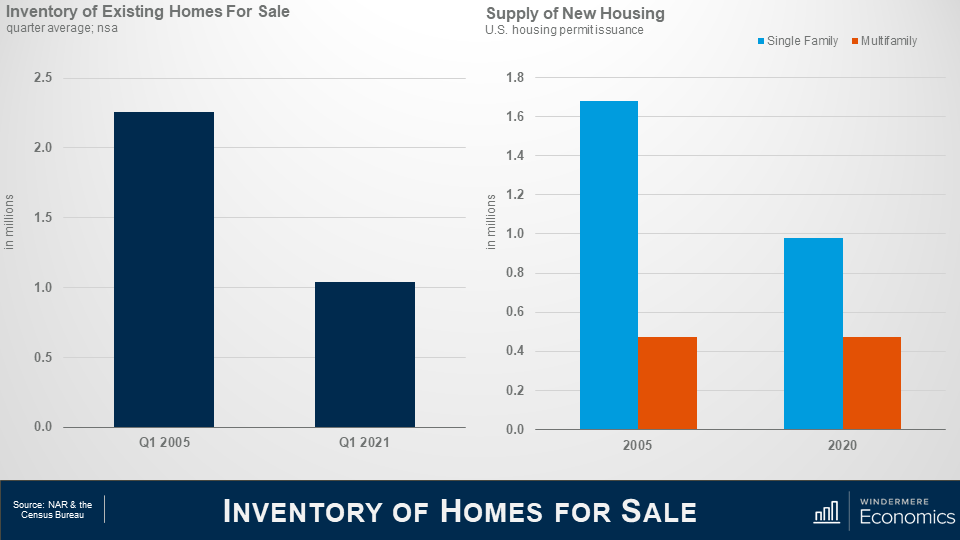
This shows the average number of existing homes that were for sale in the spring of 2005 – a date I chose as it was before the mortgage ARMS’s started to reset – and this spring.
Clearly a significant disparity. Now some of you may say that its lower because of the pandemic, but even if I were to use the spring of 2020 as a comparison – before the pandemic took hold – listings would still be 36% lower than in 2005.
But new demand can be met by building more new homes. Almost 1.7 million single family permits were issued in 2005 when the market was booming, but fewer than 1 million single family permits were issued last year.
The multifamily side is a little more complex as we cannot distinguish between condominiums and apartments, but I would suggest that although the number is pretty close to identical, the difference is that new multifamily permits last year were focused on the apartment world, whereas they were mainly condominiums back in 2005.
With low levels of existing and new homes for sale today, prices have risen significantly, but the difference I see is that during the pre-bubble years prices were climbing more as a function of speculation rather than real demand as there were significantly more homes available back then.
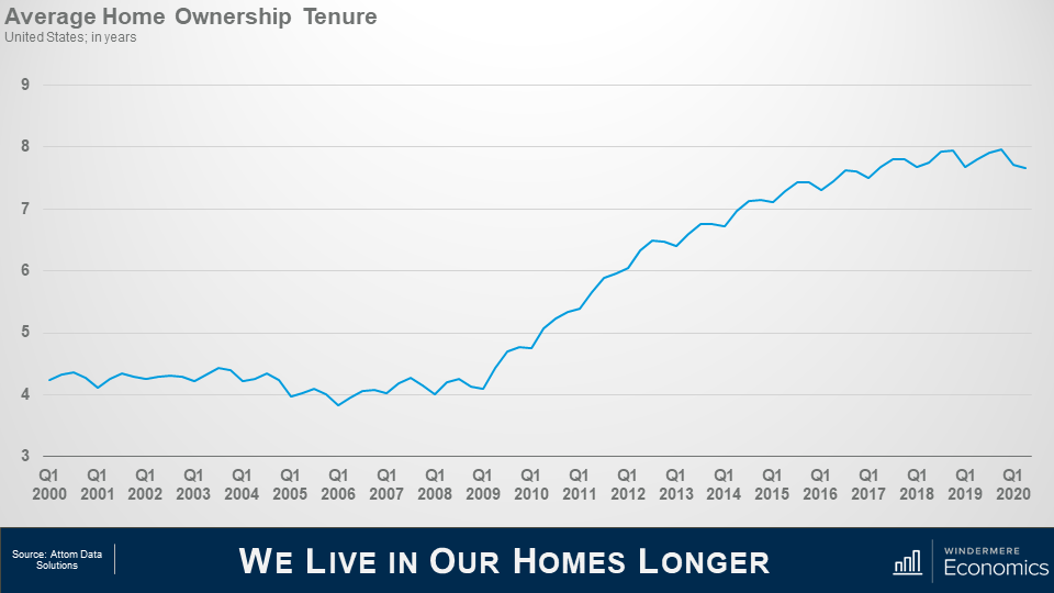
And another reason why housing supply has been so weak is that we simply aren’t moving as often as we used to.
Speculation drove home buyers to move on average every 4 or so years in the early to mid 2000’s; but look at more recent years. Mobility has dropped and we now live in our homes for twice as long as we used to and this limits housing turnover which, with the relatively low levels of new construction we just discussed, also puts upward pricing pressure on housing as supply levels stay low.
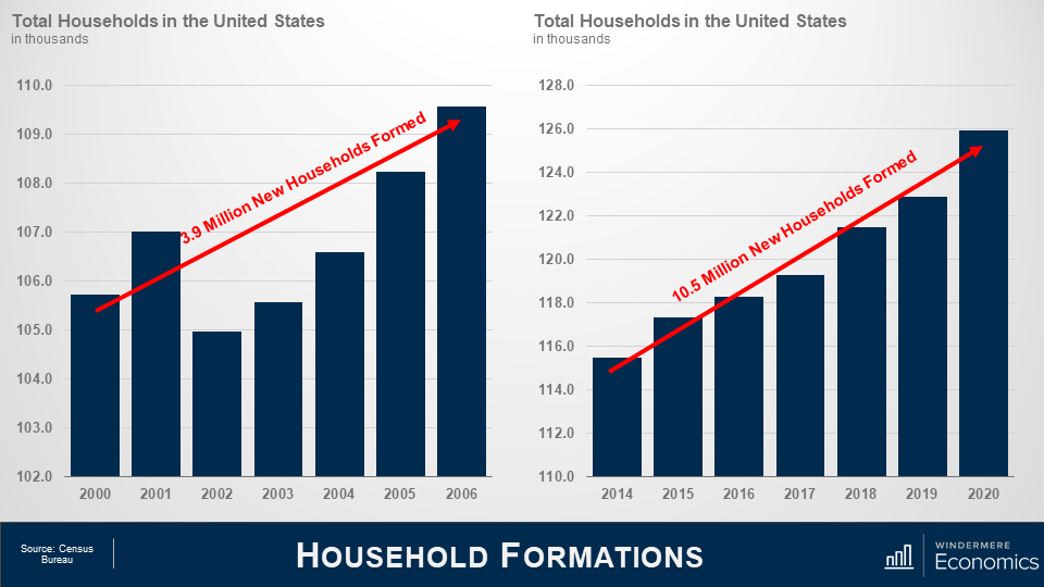
On the demand side of the equation, Census data shows that 3.8 million new households were formed in the United States between 2000 2006 which is a decent enough number.
But between 2014 and 2020, we added 10.5 million new households.
Now of course not all newly formed households become home buyers. I totally understand that. But we know that the long-term average homeownership rates in America is around 65% so it’s easy to extrapolate the numbers and conclude that demand for ownership housing continues to far exceed supply.
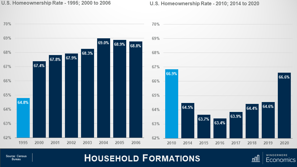
And talking about the ownership rate, some think that it is rising too fast – and that is proof that a speculative bubble is in place but look at this.
The pre-bubble period saw the ownership rate start to skyrocket, ultimately hitting an all-time high in 2004.
The rate was still elevated in 2010 and did not reach a bottom until 2016, but even though it has risen since, it remains well below the level seen in ’04.
Oh! If you are wondering about the 2020 spike, well I would take that with a pinch of salt. I say this as the Census Bureau survey in the first two quarters of last year were significantly affected by COVID-19 and I believe that the ownership rate was overestimated.
In fact, data for the first quarter of this year shows the ownership rate at 65.6% which is more realistic.
So, I think this clearly shows that although we continue to add households, we have not seen a speculatively driven spike in the ownership rate similar to the one we saw as the bubble was forming.
Well so far, we’ve looked at the supply of homes and how that has impacted the increase in housing prices; how demand continues to rise as more new households are formed; and we also covered the impact mortgage rates has had on home prices.
The Financing Side of the Equation
I promised you earlier that we would be returning to the financing side of the equation, because it is clear to me that it was the chief culprit behind the housing bubble.
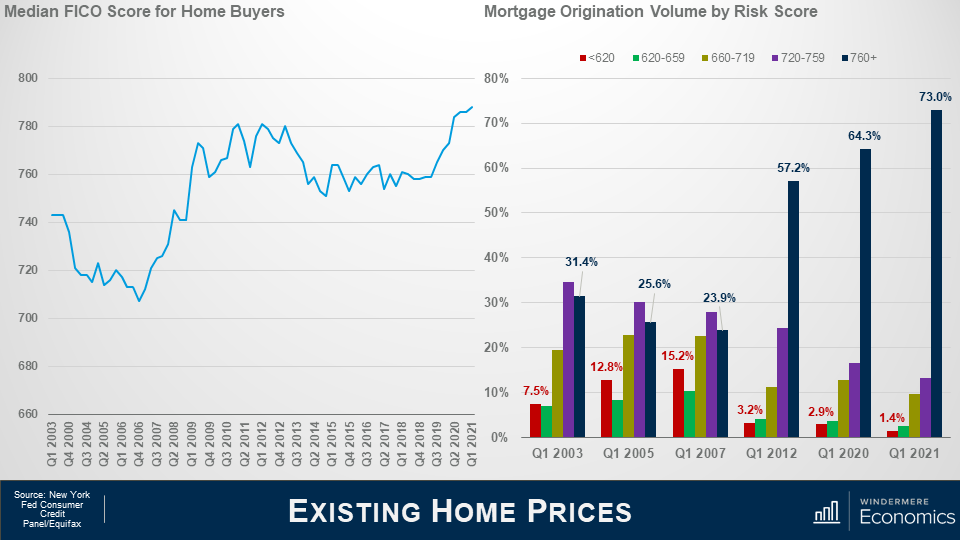
This chart shows the median credit – or FICO score – for home buyers approved for a loan and you can see the significant drop in credit quality that occurred in the early to mid-200’s.
But look at where we are today. The median credit score is now 788, and when we look at the numbers in a little more detail it’s even more remarkable as by early 2007 the riskiest borrowers – those with credit ratings below 620 – were borrowing 15% of all funds used to buy homes while prime borrowers we’re just below 24%.
But, again, look where we are today. The sub-prime share of mortgage borrowing has shrunk to just 1.4% while prime borrowers are now at a very solid 73%.
The bottom line is that credit quality is remarkably high, and not at all like the pre-bubble period.
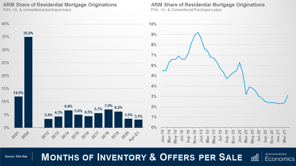
Earlier we discussed that between 2001 and 2007, mortgage debt doubled and much of this growth came via risky mortgage products – many of which were adjustable-rate mortgages that offered the buyer significantly lower monthly payments.
ARM’s accounted for 35% of all mortgage borrowing in 2004 but the current share is far lower, which should quell any concerns that there might be a wave of ARM’s resetting that could impact the market.
And as you can see here, the share has dropped precipitously, but has leveled off over the past few months before rising modestly in March.
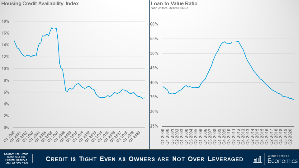
This is data from the Urban Institute that I use regularly. It’s their Housing Credit Availability Index (HCAI) and it calculates the percentage of owner-occupied home purchase loans that are likely to default—that is, go unpaid for more than 90 days past their due date, and I like this as their methodology also weights for the likelihood of economic downturns as well.
A lower HCAI indicates that lenders are unwilling to tolerate defaults and are imposing tighter lending standards, therefore making it harder to get a loan while a higher percentage suggests that lenders are willing to tolerate defaults and are taking more risks by making it easier to get a loan.
Lenders were all good taking risks in the bubble days but are certainly looking at things very differently now.
The bottom line is that even if the current default risk doubled, it would still be well within the pre-crisis standard of 12.5% that was seen between 2001 and 2003.
And this chart shows loan to value ratios – as the bubble was forming the ratio went up as buyers were getting over leveraged but look where it is now. Well below pre-bubble levels.
Again, tight credit and significant equity puts us in a very different place than we were in the 2000’s.
My Forbearance Forecast
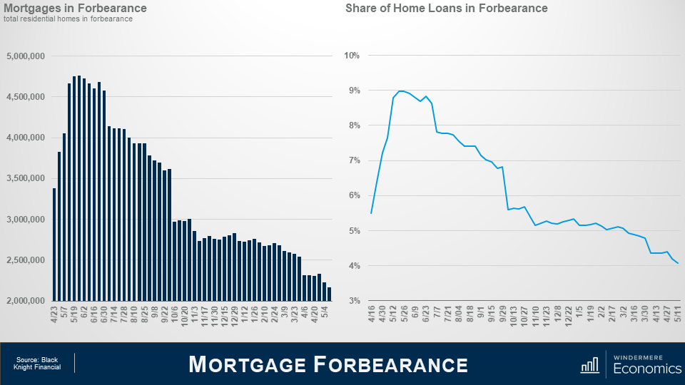
I am sharing forbearance data for one reason and it’s because some brokers have told me that they have clients who are thinking about waiting to buy as they believe that homes in forbearance will end up in foreclosure and the growth in supply could lead home prices to drop across the board, or at the very least allow them to pick up a home on the cheap.
But as you can see, the number of homes currently in the program is down by over half from its May 2020 peak – and that equates to 2.6 million homes.
In fact, even if all the homes still in the program did actually end up in foreclosure, it would still only represent a fraction of the nearly 10 million homes that were foreclosed on due to the housing bubble bursting.
And when we look at the share of total homes in forbearance, it peaked at just over 9% but is now knocking in the door of 4% and with over 250,000 more homes about to hit the end of their forbearance period, I anticipate that the numbers will drop further later month.
So why am I not worried that a large share of these homes will be foreclosed on? This is why.
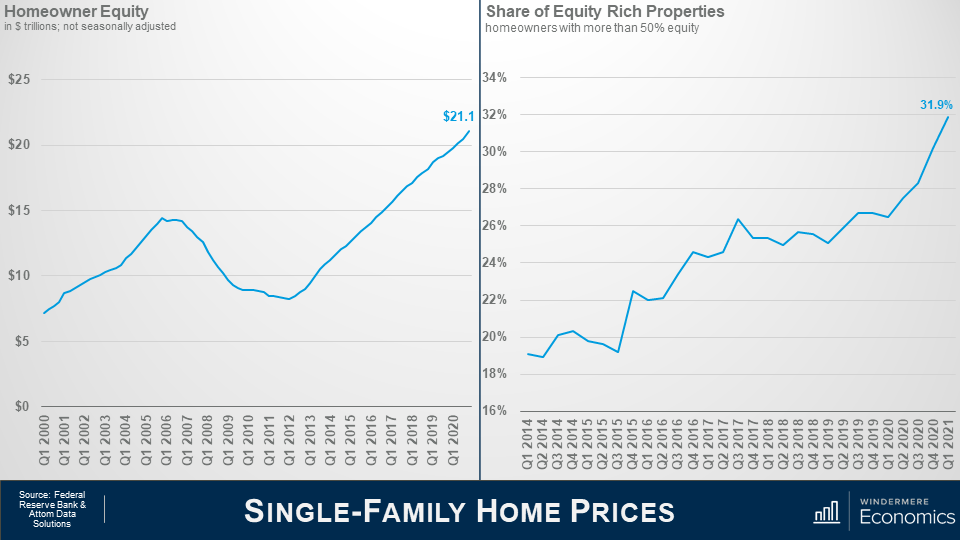
In the first quarter of this year homeowners were sat on over $21 trillion in equity – a truly massive figure.
You can see the buildup of equity as the housing bubble was forming and then it contracted through the housing crisis; however, since 2012 home equity levels have more than doubled.
My friends over at Attom Data Solutions estimate that, in the first quarter of this year, almost one in three homeowners in America had more than 50% equity in their homes – that’s almost 18 million homeowners.
And this tells me that a lot of owners in forbearance who just cannot get back on the right path still have the option to sell their homes in order to keep the equity that they have – after the bank is made whole, of course – rather than go through the foreclosure process.
And further support comes from the folks over at Core Logics who recently put out a paper suggesting that about 42% of all owners in the forbearance program bought their home before 2012 and they have, unsurprisingly, built up a sizeable chunk of equity in their homes, with median equity – even after they cover any missed payments – of almost $100,000.
Of course, it’s reasonable to say that this may all sound good, but what about owners who didn’t buy a long time ago and therefore have less equity.
Well, their data shows that 43% of owners in forbearance bought between 2013 and 2018 and they too have benefitted from prices rising and have an average of more than $87,000 in equity – again after accounting for missed payments.
And even the newest owners – those who purchased their home in 2019 or later – and they represent 15% of all homes in forbearance – well they still have an average of over $65,000 in equity.
The bottom line is that, in broad terms, a typical homeowner in forbearance could – with relative ease – cover the costs of selling a home and still have some equity left over.
Will foreclosures rise this year – yes, they will – but given all the facts I have just shared with you, I see it as being more of a trickle than a flood.
Well, there you have it.
In Conclusion
As far as I can see, all the data shows that we are in a very different place today than we were in the 2000’s and I find it highly unlikely that we will see a repeat of the events we saw back then.
Down payments are higher; credit quality is higher; and demographic demand for ownership housing remains robust and – quite likely will only grow as the nation’s Millennials continue to reach prime home buying. Remember that 9.6 million of them will be turning 30 over the next 2 years alone.
But, as I said in my opening comments, the pace of price growth that we’ve seen over the last year or so is clearly unsustainable and must, at some point start to slow, if only to allow incomes to catch up.
In fact, I am already seeing some tentative signs of this with the percentage growth in list prices starting to soften in several markets across the country which should start to ease the pace of sale price appreciation.
But I am afraid that I just don’t see a national downturn in home values occurring – unless banks decide to significantly loosen their underwriting criteria, but I find that very hard to believe.
Thank you for sticking with me during this rather long video. I do hope that you found it of some interest.
As always, if you have any questions or comments about today’s topic, please feel free to reach out. I would love to hear from you.
In the meantime, thank you again for watching, stay safe out there, and I look forward to visiting with you again, next month.
Bye now.

 Facebook
 X
X
 Pinterest
 Copy Link
